
One of the characteristics unique to the country’s growing soccer movement, at least when compared to traditional American sports, is how ingrained the ideals of localism are within the sport.
That’s not to say you don’t ever see civic pride on display at NFL or MLB games. You totally do. Many of the fans who pack the stands at any sporting event do so, at least in part, to support the players on the field representing their city. That’s as true for high school football games as it is for the New York Yankees.
In American soccer, however, that love of city is far more intertwined.
Want to see it? Head to your local club’s match. Not only will you be encouraged to scream about your love for eleven men knocking around the ball down on the pitch, but it’s just as likely that you’ll end up singing of your affection for the city at the top of your lungs, too. The odds of seeing the city or state’s flag — or a rendition of it — flying in the supporters’ sections are about as good as seeing ones specific to the team. You’ll meet countless fans who are [insert city name] ’til I die, and they’ll mean it. Turn the American soccer pyramid upside down and shake it, and you’ll see a bevy of city-centric hashtag campaigns tumble out — #OneCityOneClub, #ForOurCity, #OurCityOurCup, etc.
The same is true here in Southwest Ohio. Buoyed by a revitalization boom in the urban core that’s turned Cincinnati into one of the Midwest’s hottest markets, the accompanying upswell in civic pride has undoubtedly helped to fan the flames of success for the city’s newly minted Major League Soccer club, FC Cincinnati.
But even before the Queen City’s recent renaissance, this has always been a town that loves its own. Cincinnati Reds legend Pete Rose might be a scoundrel in many eyes, but he’s our scoundrel. There’s a cult-like culture here devoted to our unique style of chili. Drink local? We’ve been doing that on the banks of the Ohio River since the 1800’s. So when FC Cincinnati sprung to life with the backing of the city’s most prominent native son, Carl Lindner III, maybe it shouldn’t have been so surprising to see a Cincinnati flush with local pride rise up and embrace the team in record-breaking fashion.
Though with the club’s meteoric rise to MLS, some aspects of the club would have to change. And one of the most exciting among those changes is a league-required revamp of the club’s branding.
Having had extensive experience working with FC Cincinnati’s USL crest and identity, the rebrand also provided an opportunity to improve upon a primary design that was admittedly in need of a rethink. Why? The floating soccer ball panel at the top of the crest’s crown makes it a nightmare to work with in many scenarios, particularly when shown alongside logos of other teams. There’s also the gargantuan “FC” in the middle of the shield that is responsible for many in town calling the club just that, much to the chagrin of the Orange and Blue’s most ardent supporters.
But a brand overhaul is a tricky task to undertake for any professional sports team, let alone a three-year-old club trying to quickly upscale to a new, more competitive landscape. Flawed as the current crest is, people grew to accept and even love it. So botching a new look could alienate many in the city who formed a strong emotional connection to FCC’s existing identity.
Sensitive to that, the club made no secret that any rebrand would be an evolution instead of a revolution. The club would still go by “FC Cincinnati”, the orange and blue color palate would stay in the same neighborhood. And everyone’s favorite knife-wielding lion wouldn’t be going the way of the dodo. Supporter focus groups and surveys backed up that line of thinking, too.
To take on the challenge, FCC tapped the same international design firm responsible for the recent brand rethink for Italian giants Juventus. Understandably, that was a drum the club loudly beat in the lead up to their own release. And while I’m a massive fan of the Juve overhaul — admittedly, many don’t share that opinion — FCC never clarified that it would be the Interbrand office in Cincinnati handling their new look, whereas the Italian job was handled by the firm’s Milan-based office.
So what did they come up with to take the club boldly into its brand new future?
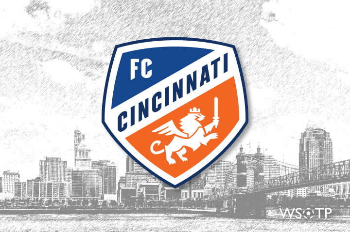
Surface level, it’s a decent bit of a graphic design work. It’s simple and unbusy — though there are some curiosities that could use some tidying. The colors are preferably darker and bolder than the previous rendition of the logo. It utilizes a modern font with Germanic inspiration similar to the Gothic lettering famous in the Jagermeister wordmark, minus the serif. The updated knifey lion is far more heraldic than its cartoonish predecessor and cleverly features a hidden “C” in the tail. The smaller secondary renditions of the crest are solid too, if not better than the primary.
True to the club’s word, it is an evolution. A version 2.0. And overall, it is an improvement on the original crest.
But for a club that has repetitively claimed it wants to be the best, it also could have been so, so, so much better.
While the design concept isn’t bad, it feels generic. It’s like one of Pro Evolution Soccer‘s fake club crests where Konami failed to secure the license for some clubs — such as with Chelsea, Manchester City, Manchester United, and Juventus — or one of the default logo options that team’s ordering from Soccer.com can customize with their own colors and name. You could drop any other city’s name into the design and it would fit that city as well as it fits Cincinnati. And while it may be a shape unique to MLS, FCC are hardly the first American soccer entity to use a pentagonal panel shape from a traditional soccer ball.
But more importantly, that generic appearance amplifies another feeling: that the new FC Cincinnati branding is devoid of Cincinnati’s personality and soul.
Outside of the Germanic font calling out to the city’s popularly aligned heritage, and well the actual city name itself stretched across it, there’s nothing really Cincinnati about the branding. It’s as if someone said “the crest’s design needs to say Cincinnati“, and that was taken far too literally.
Even the approach to revealing the branding carried that same air of generality. Check the tweet announcing the pending announcement of the club’s new clothes:
“Brand identity” is one of those marketing buzz phrases used regularly in the industry, but isn’t really something you talk about openly. Instead, you’re supposed to share the story of the design, the emotions and connections the look should conjure, the elements an untrained eye should be able to feel subconsciously.
I don’t see a story or feel anything with FC Cincinnati’s new crest. I just see a “brand identity”.
So what could have been explored to give the look more personality and congruency with the city the club represents? To answer that, I’ll turn to the words of a great English author who visited the Queen City 176 years ago:
“Cincinnati is a beautiful city; cheerful, thriving, and animated. I have not often seen a place that commends itself so favourably and pleasantly to a stranger at the first glance as this does.”
– Charles Dickens
Dickens was right: Cincinnati is a beautiful city. And that’s due both to its iconic imagery and the culture its people have built, both of which could have been used as inspiration for the club’s new look.
An easy place to start is the wealth of rich architecture that lines our streets. There’s Music Hall’s gothic revival gabled roof, corbeled brick, and gorgeous window tracery. If art deco is your thing, look at Netherland Plaza, Carew Tower, or most famously, the newly renovated Union Terminal.
If architecture is too obvious and/or periodic, consider the Queen City’s geographical beauty. The mighty Ohio River has defined the city from its founding, and its winding curves, steamboats, and bridges could all play the role of muse. There’s also Cincinnati’s seven hills which have helped to shape the city’s prominent neighborhood dynamics for over two centuries.
Culturally, there are the city’s oft-referenced ties to Germanic heritage, and with that a long-standing brewing culture, towering church steeples that dot Over-the-Rhine, and one of the world’s largest Oktoberfests. Maybe consider nods towards hometown artists like modernist Charley Harper or Maria Longworth Nichols Storer’s renown Rookwood Pottery. There was even the opportunity to jump on the train with Cincinnati’s other sports teams, as there’s a clear affinity in this market for a single letter to represent your brand.
Any of those concepts could provide fertile ground to tie the club to the people and city that support it. Unfortunately, none of them made their way into the final product. Identity doesn’t have to mean something, but when it does, it can provide a deeper connection to the community it’s supposed to represent.
And that rings even more true in a community like Cincinnati, where the community means so much to the people who populate it.
That’s not to say that bonds can’t be built with the community by a crest not steeped in Cincinnati culture. Last time, FC Cincinnati dealt with a subpar crest with fleeting ties to city in part by putting out a superior product to the competition. In other words, it’s easier to grow to like something that doesn’t feel like it represents you when the team wearing it keeps winning. But in MLS, where they will no longer be the side with vastly more resources than their competition and face clubs with significantly more time to get their houses in order, that’s a task easier said than done.
Until that point, however, some work will need to be done to help the community connect with a crest that is nowhere near the worst in MLS, but is also far from the best.
And for a club that aspires to be one of the best in North America, that doesn’t require average. It requires greatness.

Excellent article! I love a good breakdown of branding. I don’t know nearly the history that you do, but my first thought with the MLS tweet after seeing the new logo was—- they are SO similar. As you said, nothing WOW.
LikeLiked by 1 person
I enjoyed the article. As someone who lives in central Kentucky, I’ve been a longtime supporter of Cincinnati sports teams due to their proximity. FCC is no different for me and I’m so excited to have MLS games within a 2 hour drive. For me, then means that the connection of the crest to the city is not important or even a consideration. I just want it to look cool!
That being said, I was VERY disappointed in the new logo and had hoped the leak from earlier was a fake. It is just so bland an uninspiring and your comments about it looking more like a generic video game logo were so spot on that I’m going to use that in future conversations. I guess I’m in the minority, but I actually really liked the old logo (thought you’re right that the floating panel could go). I thought the shape was unique and would make it standout like so few other MLS logos do.
It’s also impacted by merchandise purchases. I had planned to load up on new swag, but I’m now avoiding anything with the crest on it. On the bright side though, at least this disappointment in my team has given me more in common with other MLS fans. haha
Thanks again for the great read!
LikeLiked by 1 person