Sitting in the league’s swanky 5th Avenue office in New York, Don Garber’s May 29th press conference announcing MLS’ 20th franchise — New York City FC — was a seminal moment in league history. There stood the Soccer Don at his podium, flanked by officials from two of the sporting world’s most prominent figures, boasting to the cameras like a proud, first-time father thanks to his pet project finally coming to fruition.
But a month out from the announcement, there are still more questions than answers about the what’s sure to become one of the league’s marquee sides.
While we know when NYCFC will join the league — 2015 — we don’t know where that will be. There’s still ongoing talk of the Flushing Meadows stadium, but continued local opposition has proven a tricky road block to maneuver around. Claudio Reyna has been named as their first Director of Football, but we don’t know who his first hires and signings will be. We don’t even know yet what we’ll call them in every day conversation… “City”, “City FC”, “New York City”, the “Citizens”, etc. Though with the club not set to begin play for another year and a half, there’s ample time to nail all of that down.
However, there is one important decision that the club does need to nail down, and it needs to do so soon: their brand and identity.
Without a doubt, this has been the most fascinating aspect of the entire “NYC2” discussion, at least since it became apparent that the league wanted another team in the New York City market. It’s not often that an opportunity arrises for a professional sports league to create a “marquee” brand from the floor up. But due to the circumstances the club was born into, they face a litany of restrictions on what their identity can and can’t be.
Take NYCFC’s eventual cross-town rivals, the New York Red Bulls. RBNY’s identity is clear, entrenched in the same image their parent company uses for all of their sports properties. That mean’s that the use of primary colors of white, red and navy are likely off-limits. Also to be avoided are the pitfalls of the Red Bulls’ previous branding as the New York/New Jersey MetroStars. So the black-red-yellow combination is probably a no-no, not to mention the “metropolis” themed imagery it used. And not to be forgotten is the iconic branding of that pesky Cosmos franchise that will be kicking off this fall in the NASL. So white and green kits are also out of the question, too.

While I’m sure all of those points will be addressed by those who will be ultimately responsible for selecting the NYCFC brand, that MLS struggled with its initial branding efforts 15 years ago still clouds my perception of how they’ll approach such matters again. Although I should probably cut them some slack, as the last six expansion sides’ (Toronto, Seattle, Philadelphia, Vancouver, Portland and Montreal) brandings were handled in a much more intelligent fashion.
So with clock ticking on New York City FC choosing their image and a boatload of limitations already hampering the selection process, what’s a new club to do?
Luckily for the both parties, the magnitude and potential exposure this kind of opportunity presents means that proposals are already pouring out of the woodwork. From agencies, individuals and even fans in forums, many will look to make a name for themselves by submitting unsolicited proposals. And as one might expect, the quality of the those put forth ranges anywhere from “shit” to “spectacular”.
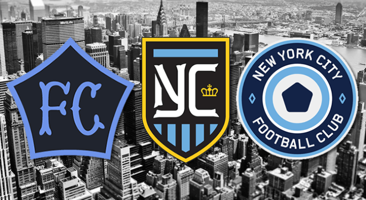
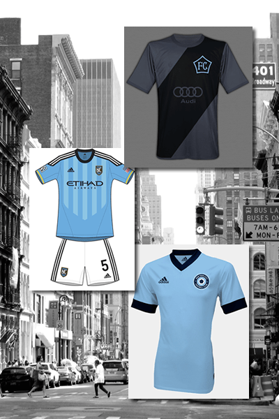
And in my humble opinion, a few at the latter end of the spectrum would be spectacular choices for the club to go with. Particularly, a trio of submissions really seem to stand out from the pack: M.Willis (brand and kits), Hyperakt and DigbyLabs.
And while they all draw from different inspirations and follow unique paths, they do all share many similar characteristics.

As will likely be the case with the final design, the primary design influence for all three of these brandings are the Manchester City colors of sky blue, white and navy. They all also aimed to avoid traditional New York iconography — the Empire State Building, Statue of Liberty, the city skyline, things of that nature — so that the club can establish their own identity without the preconceptions that come with that imagery. Each attempted to pay homage to New York’s five boroughs with a visual nod to the number five. And, lastly each attempted to come up with a logo that allows for quick identification of the club without having to write a single word.
Yet as mentioned above, the end result for each resulted in something far different.
Another aspect that all three of these proposals shared was their complete nature. In addition to proposed logos, each included a smattering of color templates, potential marketing solutions (billboards, flyers, etc.) and kits.
The areas from which the artists drew their inspirations? While both Digby Labs and M.Willis found inspiration in iconic New York sports imagery, the former developed a new take on the overlapping “NY” common to the Yankees and Mets and the latter strove to make an ensign that didn’t include a direct alphabetical reference to the city. Meanwhile, the Hyperakt effort aims for a more modern, yet classic look that sits well alongside similar crests from around the world’s game. All unique spins, yet all strangely tied together.
What will the club eventually choose? Someone being paid a lot of money will likely do a bunch of market testing on the pros and cons. And we’ll probably end up with something far more drab, and shaped like a shield like most every other MLS logo. But the kinds of designs laid out above give me optimism.
One thing, however, remains certain. Since they’re backed by Manchester City and the Yankees, I’m already inclined to hate them. But that doesn’t mean I don’t want the league to capitalize on the opportunity to create a power brand in the world of football.
They won’t have another chance to create a marquee club in this league, and selecting any of these options would be a fantastic way to make their mark.
