Appearances, they say, are everything.
It’s a saying that’s normally applied to the world of business, but apparently it’s also one that’s recently become very important to a large segment of US soccer supporters. Well, maybe they’re not so concerned with overall appearances, but at least as it pertains to crest that adorns the national team’s shirts. And for many, they’d rate its appearance somewhere between poor and complete and utter crap.
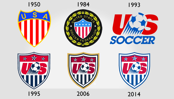
Admittedly, the current crest isn’t a great one. There are eleven stripes on the crest and three stars: what is the significance of those numbers? Last I remember, it wasn’t the “Original Eleven Colonies”. Plus, the only correlation I can find with the United States and the number three are the three branches of government. Which seems a stupid reason to have three stars on a soccer crest, and is most definitely not the inspiration… I hope. And why aren’t the stripes red and stars set in blue, like on the flag? And the bit that seems to cause the most contention within the fan base is the remnant 90’s era US logo in the middle. Was that ball shot out of a cannon? A ball being kicked over the crossbar? Or does the ball just have eight triangular legs?
Of course, the crest we have now is little more than a dress slipped over that 90’s logo by Nike after they took over the kit responsibilities after the 1994 World Cup. The previous logo, horrid on its own, just didn’t have the marketing power that Lipstick on a pig at best, yet it’s managed to hang around for nearly two decades.
And the slight modification of the crest ahead of this year’s World Cup — ditching the gold adornment and a fading of the color palette — has proven a huge disappointment for a vocal portion of the fan base.
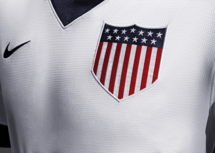
In fact, many had been hoping that the basic shield that adorned the national team’s Centennial kits in 2013 would replace the old one for the World Cup. A Change.org petition sprung up five or so months ago imploring Sunil Gulati and the US Soccer Federation to retain the use of the crest beyond the New Year. As of publication, it has just shy of 3400 signatures. Gulati even replied to the movement in July of last year, promising the federation “are reviewing the crest and will make a decision later this year.”
People seemed to like that the Centennial crest hearkened to historic crests of yesteryear for US soccer and American Olympic teams. They dug that it had thirteen stripes and stars, with appropriate coloring. And they preferred its classic silhouette and simple lines to the “cartoonish” and/or outdated feel of the current logo.
For the most part, I agree with them. The outdated current crest has outlived its lifespan, and definitely needs a rethink. I’m also a huge fan of simplistic design, and the Centennial crest offers just that. There’s no questioning what country it’s meant for at all. No frills, but it still manages to get its message across.
Not that I totally dislike the current crest. The Frankenstein-ish mishmash of a crest has grown on me over the last two decades, and has some even developed some tradition itself. After all, this is the same crest that we wore when advancing to the quarterfinals in 2002. It’s the same crest that was on Donovan’s chest when he scored the dramatic goal against Algeria in 2010. Twenty years is a long time to tie memories to an object, and undoubtedly its retirement is going to stir up strong emotions as well.

But the adoption of the Centennial crest? Yeah, that was never going to happen.
The reason for that is plain and simple: brand recognition.
If soccer was one of the most popular sports in the country that a majority of the population followed regularly, then going with a crest this simple would probably be in the realm of possibility.
Unfortunately though, that’s not where the sport is at this stage in this country. US soccer is still actively trying to grow the sport and the fan base in the United States. Picking a logo that makes no reference to or mention of the game of soccer means that the average Joe Schmo out on the streets would never inherently know that was the US national soccer team’s crest.
Let’s imagine a simple experiment with a group of non-soccer following American citizens as your test subjects. You have two sheets of paper to present to them: one has just the Centennial crest printed on it, while the other has just the current US logo.
If you show them the Centennial and ask them what that represents, the odds of them telling you it was US soccer’s would be scant. It’s a very ambiguous and could be used to symbolize any number of American entities: Olympic teams, the Armed Forces, maybe even just pro-American apparel in general. And as far as building a brand identity goes, that kind ambiguity is a gigantic no-no.
But I’d be willing to bet that, upon being shown the current crest, at least a good majority of them would know it was for some sort of US soccer team or entity.
That alone is like enough to justify keeping around the current one, despite the obvious improvement that the Centennial crest offers. Never mind that 2014 is no longer US soccer’s centennial year, or the fact that it’s a design so basic that it likely can’t be trademarked. And without the ability to trademark, that means the USSF can’t hold exclusive rights to its use, a.k.a. a likely loss of significant revenue for kits and gear.
Now, we don’t yet know if the lighter version of the crest being used in Brazil was the change promised by Sunil and Company back in July. If it is, while I’m sure many will be angry, US Soccer can continue to pump out gear and make their money and have the ability to communicate who they are with minimized confusion for new fans. It might not be that elegant, but the status quo can be maintained. And that doesn’t cost a dime.
If not, maybe we could be in store for a proper rethink.
Supporters have already dreamed up a number of intriguing alternatives, some better than others. And one would imagine that if the USSF is looking at a larger revamp, a professional design firm will be brought in to give it a go. With the federation being a very social entity of late, I wouldn’t be shocked at all if supporters were even given a say in the process.
Whatever the case may be, we’re at least going to be made to wait until at least after Brazil to find out what’s going to happen to the national team’s crests. And there’s no sense in holding on to impossible dreams or beating dead horses in the mean time.
Besides, what are you going to do: stop supporting the team just because you don’t like their crest? Because that’s even more crazy.
