 In the world of American professional sports, fresh starts aren’t exactly what I would call “rare”. Nary a year passes without some team in any of the major leagues — MLB, NBA, NFL or NHL for those who don’t follow other sports — revamping their logo, changing their name, modifying their colors, or even moving cities. It’s a never-ending race to stay modern, current and fresh in the minds of would-be fans.
Major League Soccer has been particularly susceptible to this trend.
Of the original ten teams that still survive — RIP Tampa Bay Mutiny — only Columbus Crew and the New England Revolution still had their original brandings at the start of the 2014 MLS season. We’ve had teams move (San Jose to Houston), teams who have completely changed their names (Dallas Burn to FC Dallas), and teams who have run the gamut (Kansas City Wiz to Kansas City Wizards to Sporting KC AND new colors). Even teams coming in from other leagues (Seattle, Portland, Orlando) have had to give their brands a rethink.
And to nobody’s surprise, Columbus finally decided to join the party.
Though I was sad to see their old logo go, if I’m being completely honest, the Crew logo was in desperate need of a revamping. And when new owner Anthony Precourt took over the club a year ago, he made a rebranding one of his main priorities.
Thankfully, Tony Aces made it clear he didn’t intend to make wholesale changes. The club’s name would (mostly) stay the same, as would their colors.
That was all good by me. The club’s banana-colored kits easily make them one of the most recognizable sides in the league. And the “Crew” moniker also has a good ring to it, is unique and doesn’t induce eye rolling the same way that Burn, Wiz or Chivas USA might.
All that would be needed is to give the team a new brand to get them out of MLS 1.0 mode and up to speed with the impending 3.0 form the league is apparently entering.
But where exactly does one start with this kind of endeavor? The Crew wisely set about the process in the right manner: by interviewing their fans. A survey went out last year shortly after Precourt’s arrival to properly evaluate what their thoughts are on the current brand, and where they might want it to go. And from that, the Crew were able to identify three main “pillars” of what they thought their brand should be.
Original. Energetic. And Authentically Columbus.
From there, the club went about taking those three attributes and using them to build a new face for the franchise.
And after the last few weeks of guerrilla marketing efforts literally spray painted all over Columbus, we finally got to see the fruits of Precourt and the club’s labors on a crisp fall day at the LC Pavilion in the city’s much heralded Arena District.
Normally a venue for concerts, season ticket holders lined up outside LCP well in advance of the doors opening for a very different kind of event. Decked out in black and gold and club requested “smart casual” apparel — whatever the hell that actually means — the supporters were served authentic Columbus food like Jeni’s Ice Cream and beer from Columbus Brewing Co. The walls were adorned with checkered and diagonally striped lighting, foreshadowing the new logo that was to be soon debuted. And as the hour of unveiling steadily approached, the excitement in the room was palpable.


Eventually, the Columbus players themselves arrived by way of the team bus, greeted by chants of “We Love Ya” as is often sung in the Nordecke supporters’ section at Crew Stadium. Shortly there after, the lights dimmed and a nervous hush spread over the crowd.
Post event, Precourt told myself and fellow media that he was a bit nervous then too: “There was a little bit of pressure. We were changing something that has been around for nineteen years and something we hope we don’t change again… My heart was pounding!”
Host Brian Dunseth, a former Crew player and current broadcaster, got the ball rolling. And surprisingly, things swiftly moved along after that.
He was soon joined on stage by Precourt, Precourt Sports Ventures VP Dave Greely, new Crew President of Business Operations Andy Loughnane and — the man who received the biggest cheers of the night upon introduction — Sporting Director and Coach Gregg Berhalter. They each took a few moments to build the anticipation for the reveal, explaining where the club was heading on and off the field. Next the players joined them, flanking the bigwigs on stage. And last but not least, adding to the drama and legitimacy of the moment, MLS Commissioner Don Garber stepped out to join the festivities too.


But it wasn’t until club mascot — erm, Brand Ambassador — Frankie Hejduk jumped up on stage to hype the crowd, that you really knew things were about to go down. Frankie implored with the supporters, “Are you ready?” To which keeper Steve Clark and the supporters answered with the fan-favorite’s trademark “Yes! Yes! Yes!!!” Their cries were then answered, beginning with a short video, and the moment finally arrived…
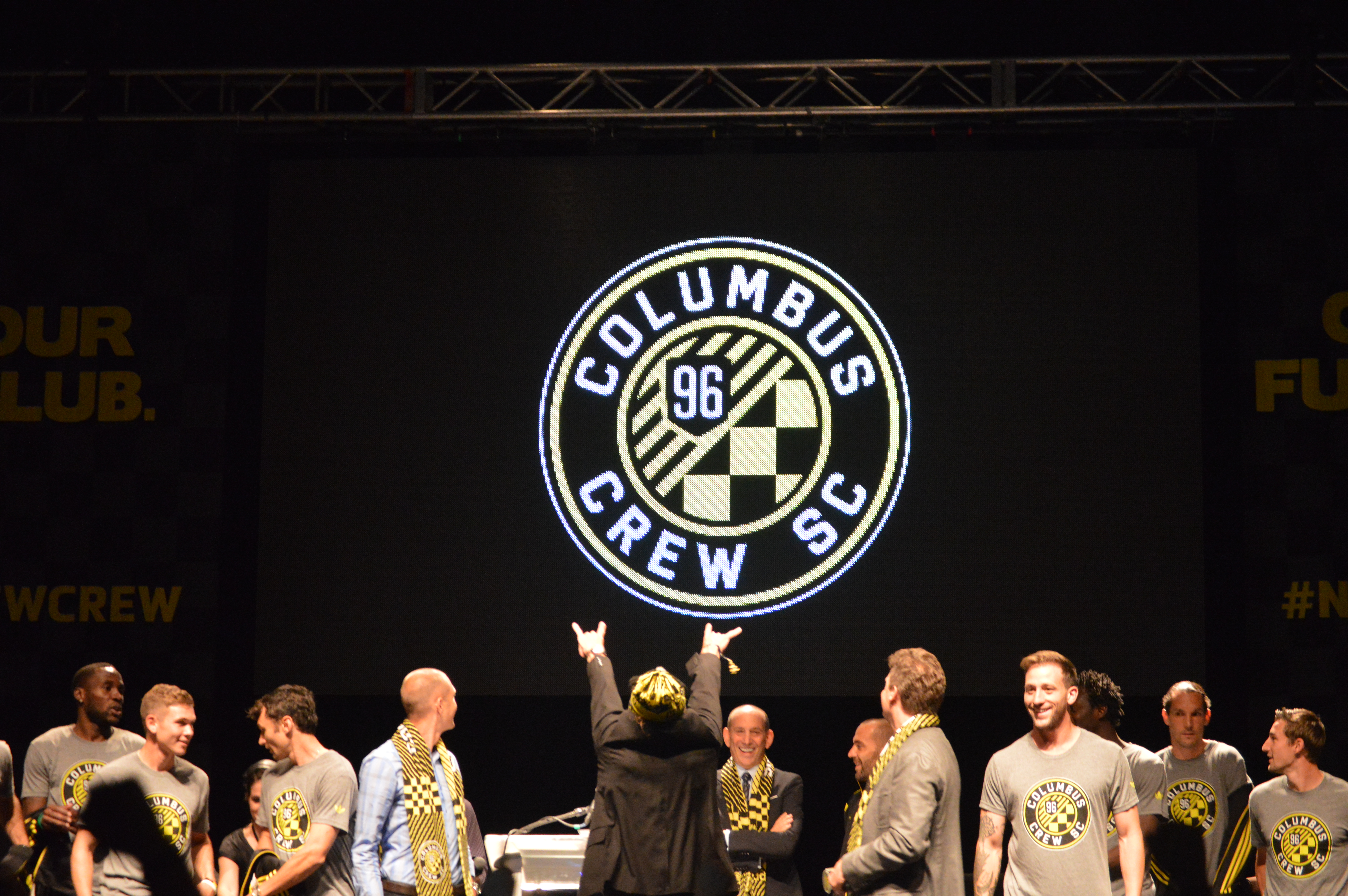
A fresh, circular logo. Clad in familiar colors. Featuring the city’s name with odes to the fan culture, the city and the state. That’s not to mention a small, but acceptable, tweak to the club name, too.
My first impression? I really liked it. It’s traditional enough without seeming stale. It’s modern enough without running the risk of looking dated in twenty years. The checkered pattern pays homage to both the supporters and city’s German heritage at once. Too, there’s the circular crest with concentric circles, a design reminiscent of the state flag and meant to represent the state of Ohio — something I had asked the team not to ignore back in February.
I also really dug that they thought to include original crest shape layered under the year of the club’s founding, showing the “New Crew” still know where they came from. That shield sits on top of 9 upward slanting stripes that are a nod to the other 9 original MLS clubs that joined after the league’s true first club, Columbus. And the name change: it added extra “soccer feel” without the cliché of a soccer ball.
Having had a few extra days to digest it, I like the crest even more than I had initially. Massive Report editor Patrick Guldan referred to it as “a grower” the night of the event, and I think he hit the nail on the head. The more time I’ve had to reflect on it the individual design aspects, the more I feel like they tied everything together perfectly.
Some have claimed it’s a straight rip off of the crest of Bundesliga giants Borussia Dortmund, but that argument holds approximately zero ounces of water. Yes, it’s round like BVB’s logo. Yes, they share the same colors. And yes, there are Germanic influences. But the incorporation of all of those elements were explained above. Plus, they really don’t look anything alike.
Others took offense with the addition of the “SC”, claiming it should have been “FC” if anything. But Precourt again offered sound reason for the decision. “I think we’re in a market where American football is very relevant. We want to differentiate ourselves. We’re competing with [Ohio State football] on Saturdays in the papers, in the sports pages so we want to differentiate ourselves there.”


But in general, the response on social media — normally a cesspool of haters and Negative Nancies — was that of approval. I saw one comment on Reddit even claim the Crew went from having the worst logo in the league to the arguably the best. To shy away from bias, I think that might be a bit oversold, but I think the new logo is definitely in the upper echelon of MLS logos.
The event itself closed out with national touring act — and again, Columbus native — New Politics playing out a set for the Crew fans in attendance. Along with Columbus’ Mayor Coleman stressing the city and the club “need” one another, the native food and beverages taking part, and the promise to bring more local business into the fold at Crew Stadium… you get a great feeling for what the Crew are trying to do here.
This wasn’t a complete makeover: it’s an evolution.
It’s tying the club to its roots, the city in which it plays, and the community in which it’s a part of. A redefining of the brand doesn’t have to be a totally new direction. It can be yet another shot in the arm to jolt the club back into relevancy.


And as I left LC pavilion, a new scarf courtesy of the club draped around my neck, I had a very reassuring feeling that things were heading in the right direction. All of the right considerations were taken, and they were executed marvelously with a design that incorporated a lot without seeming overstuffed.
Now though, let’s see what a club renewed will do on the pitch.
