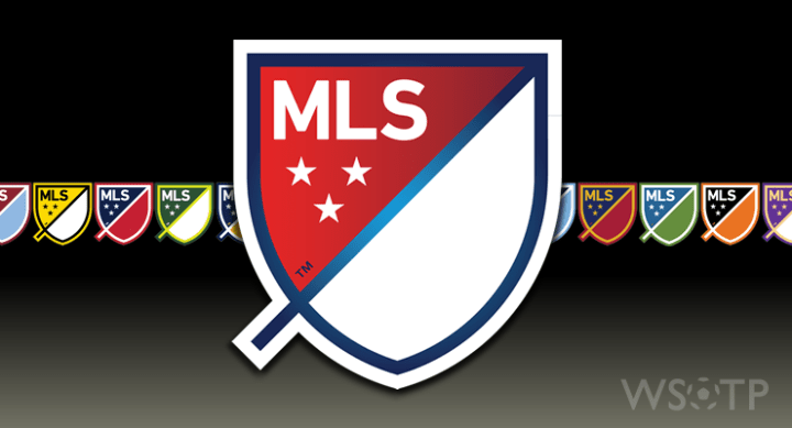
With the much anticipated release of EA Sports’ FIFA 15 today, so too came another reveal: the newly updated Major League Soccer logo.
A change of the league brand was a move MLS had been debating for a while, and most rumors placed the change in the coming off season. To many, the old logo had a cartoonish, 90’s Microsoft clipart look to it and that necessitated a refresh.
Not that my opinion really matters, but I was okay with the old one. I grew up with the it, and as such I have a peculiar sense of attachment to it for reasons no other than the memories that I’ve attached to it. That said, I wasn’t opposed to rethink either.
The timing of today’s announcement is, of course, odd. We still have a month or so of the 2014 regular season to go, plus the playoffs. Aside from maybe the MLS Cup Final, I doubt we’ll see the league using its newly facelifted look at all. However, the release of the latest iteration of the world’s most popular video game meant that MLS needed to drop their logo as well. Otherwise the league would have been condemned to using their old branding for the duration of the game’s cycle. I get how that would be a bad move, so I can sympathize with why they released it now.
But timing aside, MLS deciding to go with such a minimalist, modern look was sure to ruffle even more feathers. And having a look around the social media scene this morning, that’s exactly what has happened.
There are going to be those who despise the new look. Some will deride its shape, the acres of negative space in it, the “tail”, or because it lacks a soccer ball. There will still be those who will cry out for the return of the old boot and ball from the original logo. And no matter what the league opted to do, there would have been those who would have criticized it.
Personally, I like it. I don’t love it, but I like it. I have a feeling I’ll like it the more I see it used. That they opted to not use a ball or other traditional soccer imagery, is a good move in my book. Major League Soccer has been around for almost 20 years now: we’re past the point of needing soccer iconography to convey what “MLS” is. The NHL doesn’t have pucks and sticks in their logo, and they don’t seem to be suffering for it.
As I said on Twitter, this new concept has legs. It will just take a while for those legs to get strong enough to carry the concept.
Not that there aren’t flaws with the concept, even in the parts that are good.

For example, let’s take a look at the idea of club-by-club customization that the new MLS logo offers. I absolutely love that idea, and think it’s a really cool way of making the league more personal. But some of the variations they developed for individual clubs are either near identical — see New York City FC and Sporting KC’s flavors — or are damn near carbon copies of the league’s primary crest — as is the case with Red Bull New York. Shouldn’t I be able to look at a crest and say “that’s Chicago’s” and not “is that Chicago’s or New England’s”? Clubs having similar colors doesn’t help the situation, but there had to have been a way to deal with that.
I also think there’s some error in their decision to go the minimalist/modern route with the logo. Again, I like the look, and I don’t necessarily think there’s anything wrong with it. But one of the reasons MLS used to justify the change was that the ball and boot look “dated” the league. However, going with something so decidedly modern right now means that this logo itself will ultimately look as 2010’s as the old logo looked 1990’s. So don’t be shocked if in ten year’s time — and that may be an overly kind estimate — the league has to rebrand again. The new design’s staying power just might not be there.
Ultimately though, regardless of your opinion or mine, it’s the route the league has chosen to go with for the time being. It might not be your cup of tea. You might not like the league’s justifications. True, some of the explanations the league used to justify its decisions are flaky. Likewise, the new logo has flaws.
Yet all designs have flaws. And all designs won’t please all people.
If you hate it, there’s not really much you can do about it. And if you like it, then great. I seriously doubt that anyone will stop following the league because they dislike the logo it uses.
But tomorrow the sun will rise, balls will still be kicked about on fields around North America and we’ll still have a league that’s played out on our shores. And before you know it, there will be something else for everyone to throw MLS under the bus for.

