I’m a doodler. Always have been.
If it were possible to drum up my notes from my years in school — hell, even my notepads at work today — you’d find a timeline of my interests sketched out in the margins. Things like dinosaurs, Ghostbusters and Teenage Mutant Ninja Turtles featured heavily in my early childhood drawings. But once soccer became a major focus in my tween years, it predictably also became the major focus of my doodlings.
My soccer drawings knew no bounds. Designing my own panels for Adidas’ famous Tango ball silhouette was a favorite, as were portraits of my favorite players. I spawned an imaginary boot company or two. Sometimes I’d sketch out reproductions of the logos of my favorite teams, and other times I’d even make crests for clubs that existed solely in my mind.
I get what you’re thinking: that I drew things I liked as a kid isn’t particularly interesting. Tons of kids are into drawing, coloring and all sorts of other artistic endeavors. However, most abandon those hobbies as they grow up for reasons all over the map — losing the passion for creating, not actually being very good at it, or a lack of time as we pursue what most consider to be more-lucrative skills to support themselves as adults.
It’s not that you can’t make it as an artist in this day in age. But just as I’m discovering is the case within the world of sports journalism, it’s really hard to do so. Not only do you have to have the skills, but you also need to catch a lot of breaks.
Now, I consider myself lucky: my parents didn’t force me to put down my pencils, grease pens and paintbrushes. They didn’t view my doodles and drawing as a waste of time or energy. Instead, they encouraged the exploration of my creative abilities. One of the most touching letters I’ve ever received was a letter my mom wrote to me during a retreat in high school where she admitted that she wished I still focused on my drawing. This website — and all of the art I’ve made for it — likely exists because of that encouragement.
But despite all that, I still opted not to pursue creative works as a career.
Admittedly, I’ve gotten to use some of those artistic skills in my “real world” jobs — first while designing websites, and now again in my current gig as an instructional designer. But getting to make things that were within my realm of interests and that someone would actually use in a professional setting? That dream seemed long dead.
However, that all changed when the NPSL’s Cincinnati Saints opted to make a migration north to Dayton and I was given the opportunity to re-brand the club.
For those who weren’t already aware, one of the many breaks I’ve caught while pursuing my soccer journalism dream is getting to work with the Saints and their owner Dave Satterwhite. Initially, it was simply reporting on the Saints as a part of my local soccer coverage nearly three years ago. But that grew into Dave inviting me on as one half of their match broadcast commentary team (along with #Pondcast co-host Jeremy Lance) and eventually as an adviser of sorts, too.
And over the last few months, Satterwhite has opened his doors even further and welcomed myself, Jeremy and a few others to help weigh in on the future of the club. That’s included whether to move the team due to an encroachment by a new, wealthier club in Cincinnati, and what we would look like afterward if that was the choice we made.
I won’t delve too deeply into decision making process here — besides, I’ve written about that already — but the choice was taken to abandon our birthplace of Cincinnati and head north to the less crowded confines of Dayton. What I will delve into here, however, was the arduous task of deciding how the team should be framed once we got there.
As we saw it, there were two options: A) keep the existing Saints brand or B) reset to square one in Dayton and adopt a new name. Both approaches had their positives and negatives.
Keeping the “Saints” moniker could give us a platform to build on. Satterwhite and countless others had has spent the last six years building that brand, and keeping it might help with name recognition. Too, starting from scratch is a lot of work. Rebranding, however, could offer the opportunity for a fresh start. It would give the team a chance to choose a name that many in our new home could relate to and better represented the city. Shedding the old name could also help to shake off incorrect claims of failure in the Cincinnati market.
Ultimately, it was decided that the “Saints” name belonged to Queen City. Plus “Dayton Saints” just didn’t offer that same pleasing alliteration as it did when paired with Cincinnati.
But with new sides seemingly popping up every other day across the American soccer landscape, it’s clear that picking an identity is no easy task. You need a name and logo that fans can identify with, but also won’t roll their eyes at or loathe. And the line between acceptability and rejectability is razor thin.
Take for example the growing trend of clubs bucking American sports naming convention of City + Nickname, and adopting more European-esque names. While that was a palatable tendency at first, it’s gotten so repetitive — FC Dallas, New York City FC, Orlando City SC, Atlanta United FC, LAFC and those are just in MLS — that it now seems downright lazy. Did you spend more than three minutes thinking about this? And that’s not including the more ridiculous examples, such as Chivas USA, Real Salt Lake or the newly instilled Rayo OKC. If Dayton’s NPSL club was to go that route, we concluded it would only be if it truly made sense to do so.
Too, we wanted a name that would resonate with the city and markets we were trying to reach in Dayton. We considered the usual “Gem City” references, but none felt as if they stood out. Wright Brothers references were also ushered away. So we then solicited suggestions from trusted locals in the Dayton area. And surprisingly, that bore fruit. One name was suggested far more than any other…
Dayton Dynamo.
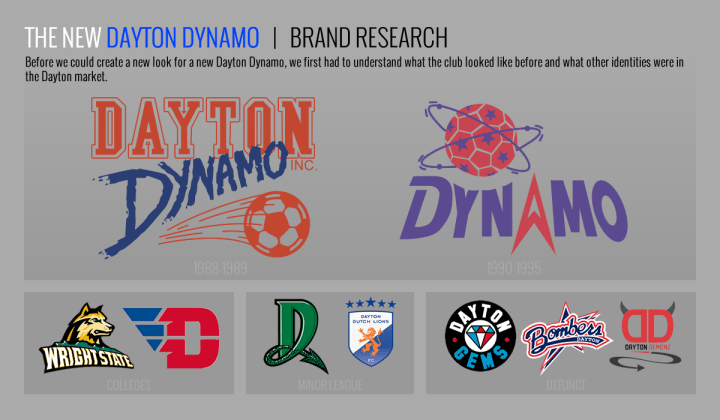
Now, as a kid who grew up in the urban sprawl between Cincinnati and Dayton, the Dynamo were my first ever in-person exposure to professional soccer. From 1988 to 1995, the club played in front crowds upwards of 4000 fans in the fully professional National Professional Soccer League (NPSL) — not to be confused with the NPSL our club plays in, which is the National Premier Soccer League — then the country’s first division indoor league. Guys like US national team standout keeper Tony Meola plied their trade in the league, and I can vividly remember cheering on players like Danny Pena and Tony Bono.
So to say the “Dynamo” name resonated with me too would be an understatement.
Yes, it could be considered a European name — Dynamo being a common moniker in Eastern bloc countries — but it was one with which Dayton already had history. We weren’t just plopping an “FC” on to the beginning or end. This is a name that long-time Daytonians could instantly recognize and embrace, and those without ties to the old team wouldn’t instantly hate. And we got our pleasing alliteration back, too.
But even with a great name in tow, that was just half the battle. It was clear that a new look — or at bare minimum a refresh — was needed for the club, too.
The original Dynamo logo offered little guidance: it was your average 80’s clipart mishmash, and lacking in direction and symbolism. The second iteration of the Dynamo logo, with its atomic soccer ball and stylized name offered far more. But after exploring some modernized interpretations of the logo, we still didn’t feel that any of them provided the connection to the city that we were hoping for. It just felt like an extension of the old team, so we went back to the drawing board.
Too, the color scheme was something we wanted to address. While there’s nothing inherently wrong with the red and blue look, it is the same one utilized by the University of Dayton Flyers, as well as two of the city’s defunct minor league hockey teams, the Dayton Gems and Bombers. Green was also out, as the primary color for both the Wright State Raiders and the Dayton Dragons. Adjusting the color palate would allow us a bit more differentiation.
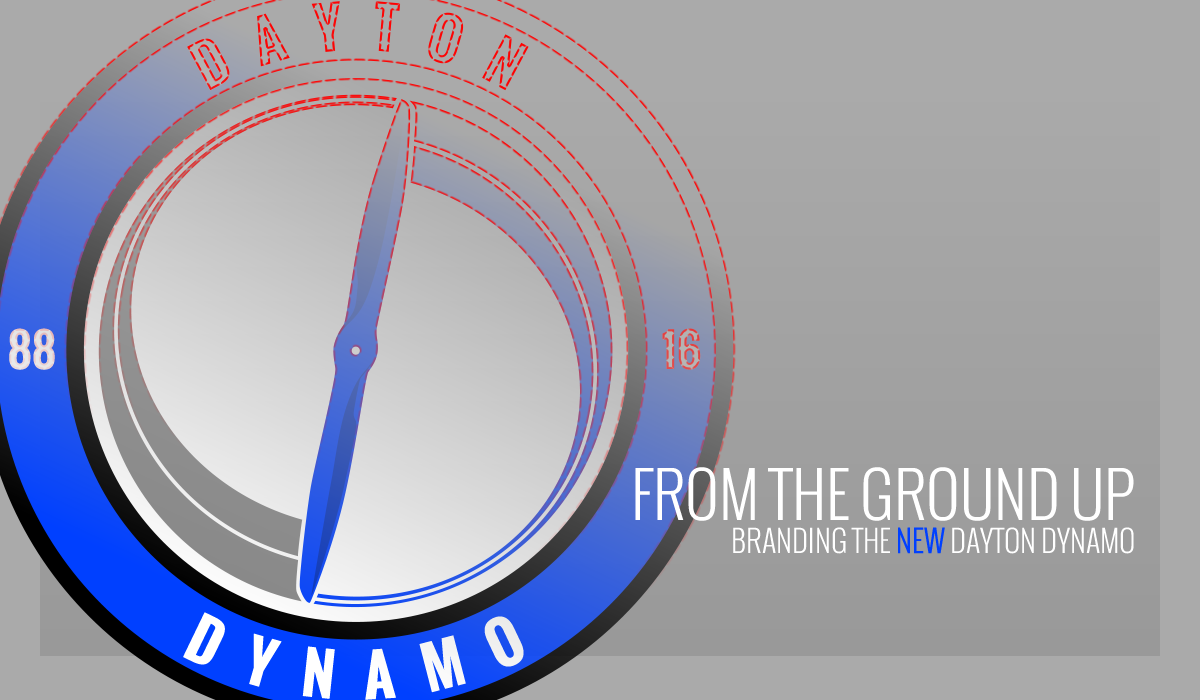
Here’s what we settled on…
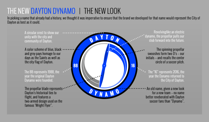
While an aeronautical theme is one that is oft utilized for Dayton sports teams, it felt like the most appropriate way to represent the city without going the obvious routes of a jet or bomber pilot. And when added together with the swooshes from the spinning motion — also a nod to the spinning motion of an electrical dynamo — the propeller provided some excellent additional symbolism.
The cyclical nature of the design also felt very appropriate given the history of the Dayton Dynamo brand. In 1995, the original Dynamo franchise rights were sold off to a group of Cincinnati investors, and the club moved south to become the Cincinnati Silverbacks. As such, the grey swooshes represent the old club leaving Dayton, while the blue represent our club returning the name and brand back to its rightful home.
Another major goal of mine was to ensure that whatever design we came up with could also be easily recognizable when given a monochromatic color scheme. The logo can also be broken apart so that just the propeller — or the propeller paired with larger straight line letters — could be used as a secondary logo.
Now, I’m not foolish enough to believe everyone will love the logo. There will always be detractors. But I’m hopeful that it will be well accepted and that it can make a mark both in our new home market of Dayton, and in the wider American soccer community.
I can say this much though: there are few works of art that I’ve produced about which I felt more proud. There’s something incredibly pride inducing about watching one of your creations splayed across giant screens and plastered on the front of a kit. If I’m lucky, maybe I’ll even get to see a player kiss the badge.
At bare minimum, this logo is the realization of a life goal that I never thought I’d actually have the opportunity to achieve. And I’ll forever be indebted to Dave and the Dynamo for the opportunity.
